
BLOG
TIME TO BUY GOLD AND/OR SILVER?
- By theinvestmentcompass
- •
- 14 Oct, 2015
The financial advisors at The Investment Compass are not in the business of making predictions, however, having been a close observer of both Gold and Silver for many years I thought I would comment on the current conditions of both of them.
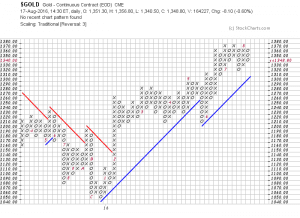
Gold first.
Here is the current Point-and-Figure chart of Gold:
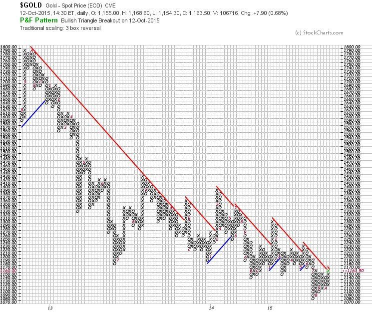
The double top seen in the upper left hand of the chart at 1790 in 2011 is seen more clearly as a top in this market when we take a look at GLD, the ETF representing the Gold market.
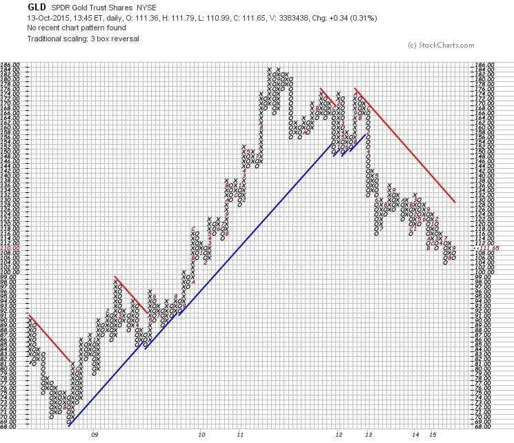
It is clear from this chart that GLD has moved through three major changes during this time frame – 2008 to its current price in 2015.
A down trend ended in 2008. The uptrend lasted from
2008 to 2012 and we currently are looking at a down trend since then.
The question now is, “How long will this down trend continue?”
Just because the down trend covers roughly four years as did the previous uptrend, is not a reason to believe that the down trend will end soon. It might not.
Nevertheless, I believe it is worthy endeavor to take a fresh look at Gold.
Another tool we use at The Investment Compass is the Inverse ETF of Gold, GLL.
Here is what that chart looks like:
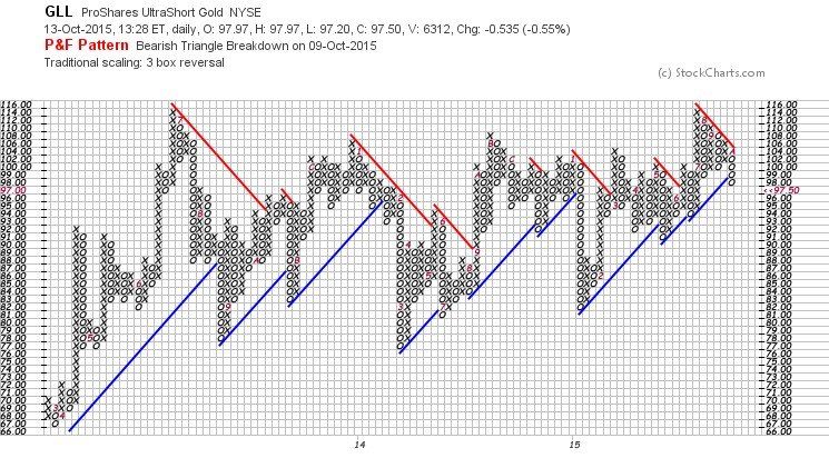
It doesn’t appear, from looking at this chart, that buyers of the inverse (remember, they are the sellers of Gold) are as enthusiastic as the sellers of Gold.
Put another way, there doesn’t appear to be a lot of investors willing to “short” Gold.
With that said, and with seeing the resistance of buy the inverse ETF at 114 (seen both in 2113 and this year, 2015), there would be an argument that since the inverse Gold is not attracting buyers, perhaps it is a signal that buyers will find GLD attractive.
Another belief within the investment and financial advisor community is that Gold and Silver oftentimes move in concert with one another.
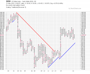
Let’s then, take a look at the current Silver market by first looking at the Point-and-Figure chart of spot Silver.
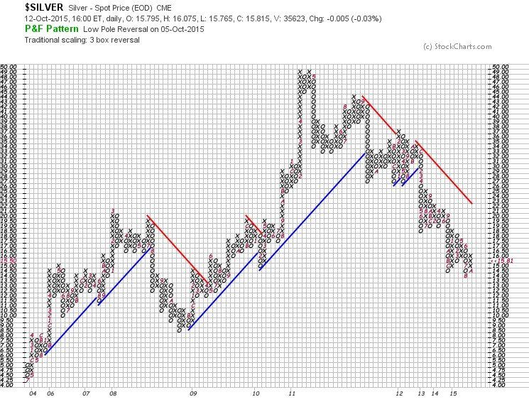
This chart covers even a longer period of time than the one shown earlier with Gold as there are actually four market cycles.
Again, as with Gold, we see roughly the same four year cycles in Silver.
Here is what the Silver ETF, SLV chart looks like:
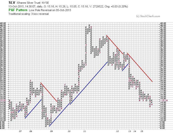
The chart virtually mirrors the chart of the Silver Index seen above and clearly shows the downtrend in the last four years and would be confirmation that the two precious metals, Gold and Silver, do move in concert with one another.
So, let’s have a look at the inverse Silver chart to see if we can glean any further clues.
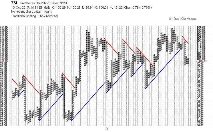
Sellers of the Inverse Silver ETF seem to be more prevalent than the sellers of the Inverse Gold ETF.
This is not enough evidence for one to call a reverse in the Silver market.
If we look at just one more chart, perhaps we can come to a final conclusion to our original question.
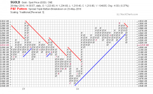
That chart would be the chart of the Gold and Silver Index that trades on the Philadelphia Exchange, seen below:
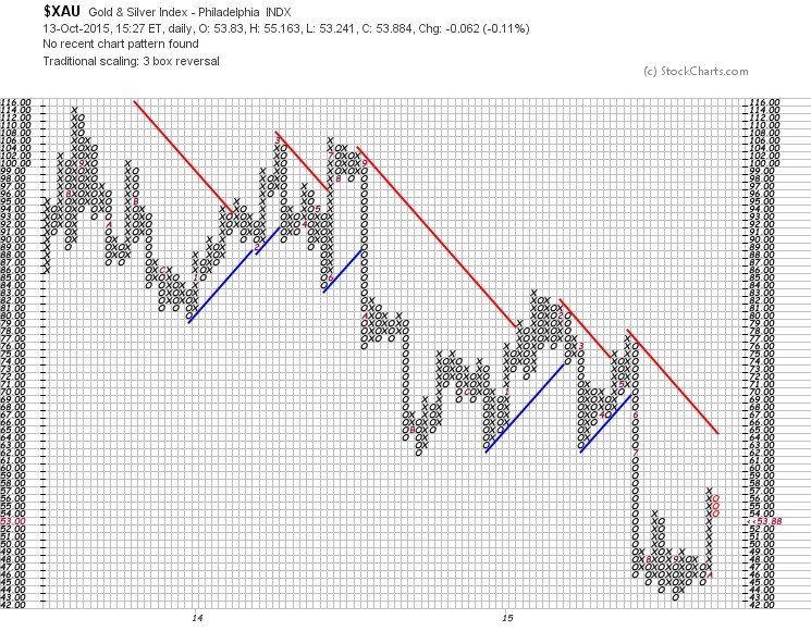
This chart confirms, in my opinion, that we have not seen a bottom in Gold and Silver prices. We may be close and I would like to see this index break through the resistance at 63 which where there is both the red resistance line and the three bottoms of the column of Os at that same price.
The Investment Compass is an innovative process and it is my premise that we wait for the buyers and the sellers to resolve the issue of when it is time to buy Gold and/or Silver.
Many investors want a definitive answer to the question and it is The Investment Compass’ definitive answer that we have not seen the bottom (albeit close) of the precious metals.
Contact The Investment Compass today for expert financial advisor services in Bigfork, Montana and beyond!
Weighing-In on Gold and Silver……..What’s the Real Truth
In the past few weeks, I have been amazed by the extreme range of predictions on the price of Gold and Silver (Harry Dent [ www.economyandmarkets.com ] says $750 and Jim Rickards [ www.silverdoctors.com/Jim-Rickards ] says $10,000), so I decided to weigh-in on the subject (without the predictions!).
Let me say first, that this is a great example of why I wrote my book and why I do the work that I do.
Pundits can, and do oftentimes confuse investors. This creates doubt and causes investors to ask, “Who do I believe? Who is correct? “What is the Truth?”, and as the result, end up doing nothing when their personal instincts say otherwise.
My work is about “What Is” – logical, simple and easy to understand.
As usual, my analysis begins with an index, in this case, the Index for each of the metals, then the respective ETFs as well as the Inverse ETFs for verification.
And, at the end of this blog, I will take a look at the Gold/Silver ratio that many folks like to monitor.
First, the Gold Index:
Update on Gold
Gold has been a “hot” topic in the media so I decided to check-in on the subject – showing you what is really happening.
First of all, the Gold Index: (If you click on each chart it will make them larger)