
BLOG
EVERYONE AGREES – SO WHAT?
- By theinvestmentcompass
- •
- 16 Sep, 2015
Everyone Agrees – So What?
Ever since the now infamous “Six Days of August” took place in the stock market, the press has been filled with reports that it was the long-awaited correction pundits have been expecting for quite some time now.
Yes, it was, by definition, a correction.
Here is the one version from Dorsey Wright’s Monthly Update:
“It’s official – the S&P 500 Index (SPX) has seen a 10% correction since the May peak. All told from the May peak to the low on Tuesday, August 25th, the S&P 500 experienced a 12.3% pullback. This is the first time the S&P 500 has pulled back by 10% since 2012, which took from April 2012 to June 2012 to complete. While this most recent pullback has been relatively swift, this is not an uncommon occurrence, especially in bull markets. “
OK, so with that “noise” out of the way, the real question is – So What?
What investors really need to determine is:
1. Is this a buying opportunity for another leg up in the bull market?
2. Or, is this the beginning of a bear market?
The truth is, in spite of what we may read, no one knows – believe me, no one really knows.
And, that is precisely the reason why the most logical investment tactic to take is to look at the unbiased and objective view as seen in the Point-and-Figure charts.
Let’s look at the various equity markets around the world, starting with The Dow Industrial 30, here in the States:
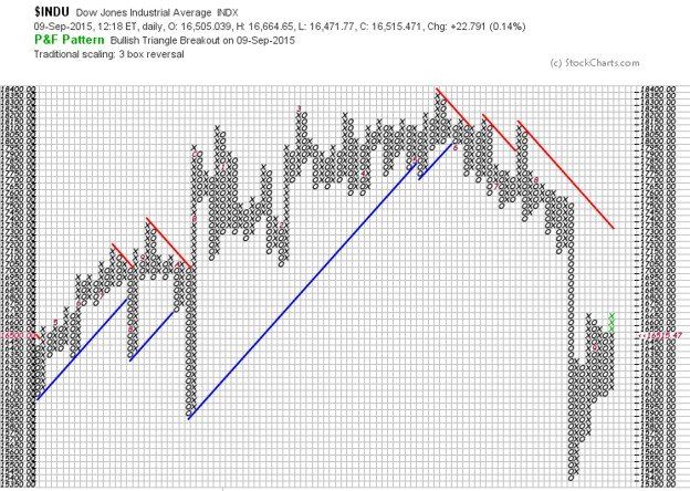
Clearly, the uptrend indicated by the blue support line has been penetrated.
Granted, this is only 30 stocks in our marketplace, however, it is one closely watched by investors around the world.
Also, note the lower highs (column of Xs) and the lower lows (column of Os) since the all-time high made in May.
Next, the S&P 500 (one of the principal points of The Investment Compass):
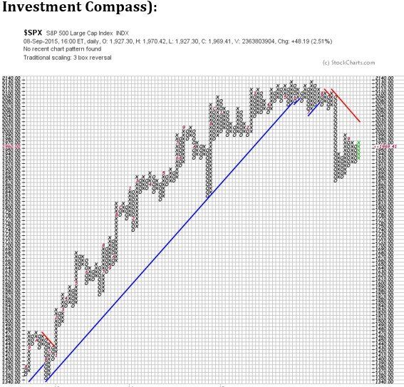
The uptrend from 2009 has also been clearly broken (below blue line). While at the same time, sellers took this major US stock index through two important support levels – 2050 and 1990.
Next, let’s look at a second principal point of The Investment Compass, the MSCI EAFE (Europe&FarEast) Index:
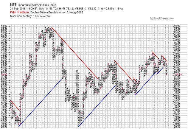
This index was not as severely attacked by sellers as the Dow Industrials and S&P 500 seen above.
However, the blue support line has been broken and this index is currently at an important support level – Note previous column of Os in 2013, 2014 and this year, 2015 – at 57 to 59.
Other large global markets show similar weakness in their Point-and-Figure.
On the next page is the much talked about Chinese stock market:
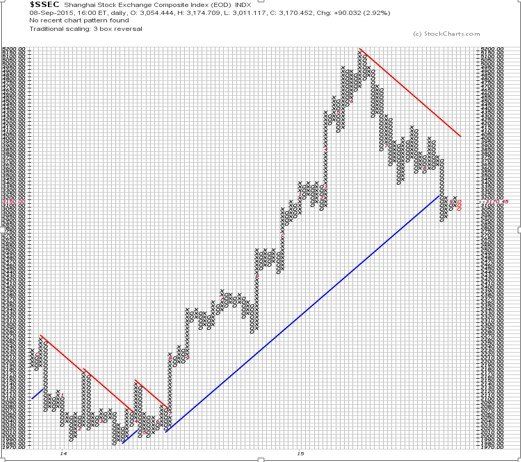
Again, we see this index, like the others above, also below the blue support line and at an important support level.
A final piece of information I believe informed investors should know about is shown on the next chart.
This chart depicts what buyers and sellers are doing on the “short” side of the market.
Short sellers believe the market will go down and will profit as the result.
It is not necessary for investors, today, to take on the risks inherent with shorting. One simply has to buy Inverse ETFs.
Below is the Point-and-Figure chart of SH, the inverse (or “short”, if you will) of the S&P 500. If the stock market continues lower, this ETF will go up in value.
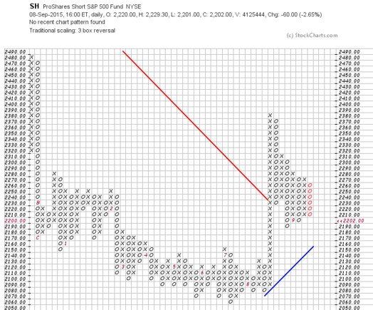
This chart indicates the downtrend in SH (remember, this ETF goes down as the S&P 500 goes up) has been penetrated.
Buyers have taken it above the red down-trend line and a potential uptrend (blue line) appears to have begun.
Adding all of this information together, it is the conclusion of The Investment Compass that there is solid evidence that the uptrend we have enjoyed since 2009 may be ending.
Major change is taking place and sellers in a massive show of numbers are dominating the current stock markets around the globe.
Feel free to contact The Investment Compass:
www.theinvestmentcompass.com
or call 406.407.0608
Weighing-In on Gold and Silver……..What’s the Real Truth
In the past few weeks, I have been amazed by the extreme range of predictions on the price of Gold and Silver (Harry Dent [ www.economyandmarkets.com ] says $750 and Jim Rickards [ www.silverdoctors.com/Jim-Rickards ] says $10,000), so I decided to weigh-in on the subject (without the predictions!).
Let me say first, that this is a great example of why I wrote my book and why I do the work that I do.
Pundits can, and do oftentimes confuse investors. This creates doubt and causes investors to ask, “Who do I believe? Who is correct? “What is the Truth?”, and as the result, end up doing nothing when their personal instincts say otherwise.
My work is about “What Is” – logical, simple and easy to understand.
As usual, my analysis begins with an index, in this case, the Index for each of the metals, then the respective ETFs as well as the Inverse ETFs for verification.
And, at the end of this blog, I will take a look at the Gold/Silver ratio that many folks like to monitor.
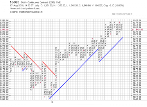
First, the Gold Index:
Update on Gold
Gold has been a “hot” topic in the media so I decided to check-in on the subject – showing you what is really happening.
First of all, the Gold Index: (If you click on each chart it will make them larger)